Making music with Michael Hersch
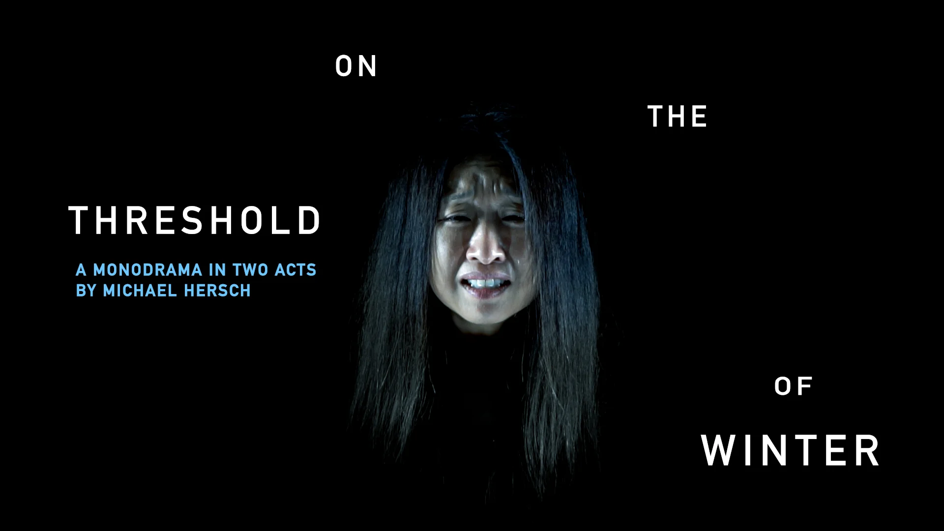
Editing the 2018 trailer for "On the Threshold of Winter" turned into remixing Michael Hersch with Michael Hersch. It was great. Here’s what happened.
Treating the text
I started with Max Bowman’s high frame rate footage of Ah Young Hong, which he captured to incorporate into his video design for the live performance. Since the only visual elements in the trailer would be Ah’s expressions and the text, the type needed to do some of the conceptual heavy lifting.
From the beginning, I was set on the DIN typeface for the text treatment. DIN has an interesting history. It was adopted in 1936 by the German Institute for Industrial Standards for general signage and administrative applications. It has been suggested that the “face’s design was not foreseen to be used in advertisements or other ‘artistically oriented purposes,’ and there were disagreements about its aesthetic qualities.” However, this directness and transparency suits the aesthetic of Hersch’s opera rather well.
The immediate legibility of the typeface allowed it to activate the space around Ah without pulling your attention away from her. For some reason, it made sense to test this legibility by spreading the text out in an extreme way. I considered the aesthetic effect of this as the text becoming like trees with no leaves.
Collaborative Scoring with Michael Hersch
Initially, I laid out some music cues conventionally in the timeline; I emphasized visual cuts with instrumental swells and sharp attacks. When Hersch suggested adding more tracks to modify the textural density, this evolved into an exciting project of remixing the music of Michael Hersch with the composer himself.
I would arrange the audio he sent me, we would discuss, I would interpret, and this would repeat. We arrived at a final score built from 31 individual selections from a variety of works. You can hear the audio below.
Hersch’s music is probably most recognizable for its emblematic use of tone clusters. Our collaboration was an illuminating window into how Hersch hears and speaks musically.
Welcoming Wabi-sabi into the process
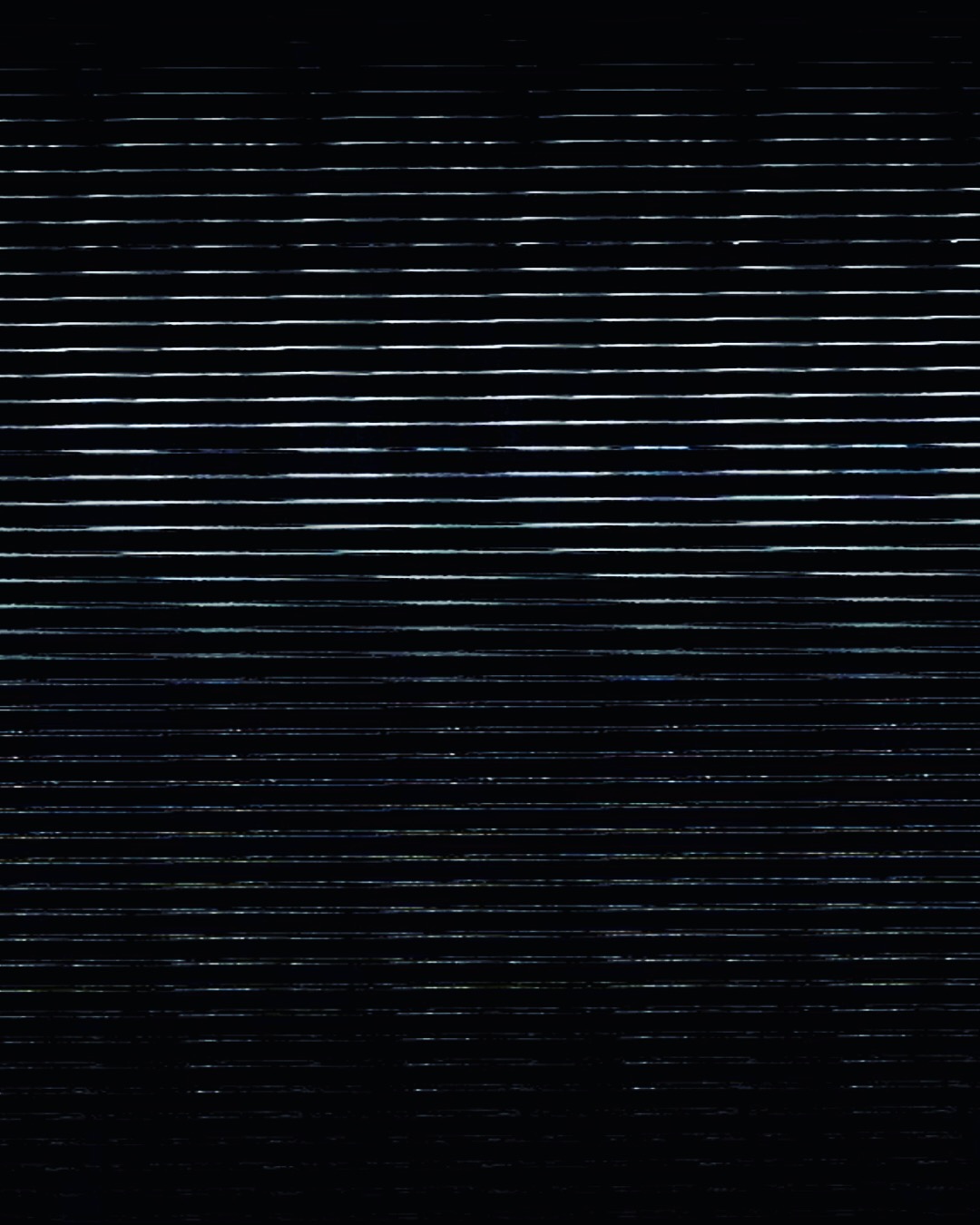
I held onto an interesting export glitch from an early version of the final video because I like these sorts of awkward remainders of art projects. I shared a still from this on my Instagram and Max Bowman contacted me about folding this into his projection design. I ended up getting even more mileage out of this accident by incorporating the footage into the social campaign for the opera’s DC premiere.
Wabi-sabi is a worldview and aesthetic that embraces imperfection and asymmetry. Sharing this failed attempt on social media actually led to a second creative life for one of these awkward remainders.
I always like to push the conceptual ideas behind an artistic product to the point of failure, to stress test my instincts. Hersch and I were of a similar mind when it came to keeping image, text, and music always at their most extreme point of tension. We could have always dialed things back, but never did.

